

Typography Principles on Web Design.
The internet has always been a great place to showcase typography. Just recently designers are taking advantage of it.
Typography is the art and technique of arranging type. It is often used to make the text more readable, attractive, or understandable when displayed. Also can help with the user experience on a website. It can create a better reading experience and improve navigation on a site.
There are many things to consider when designing typography for a website. The size and alignment of text, as well as the font selection, all come into play when determining what type of typography to use.
The internet has always been a great place to showcase typography. It’s just that it was never really until recently that designers were able to really take advantage of it. But now, with the rise of responsive web design, typography is becoming a much bigger part of website design.
Here are some principles of working with typography that will help improve your experience:
Font
Why font choice matters
The font choice for a project is difficult to overestimate because the success of the entire project will depend on this decision. The right font can make your message more persuasive or give it a sense of authority. We will explain the 3 different steps that will help you to choose the right font.
1. Determine the purpose and nature of the project.
Based on the context of the project, on the branding and emotions that the designer wants to convey for example; Neutral or display, serif or sans serif, classic or futuristic. The type of font is chosen, this is why the font becomes the soul of the project.
Normally, you choose 1-2 fonts for your projects.
2. Line-height & Tracking
Line-height and tracking will depend on the font, its size, and purpose (if it’s for reading or heading).
For example:
PARAGRAPH / TEXT
SIZE:14PT (PX), LINE-HEIGHT: 120% –130%, TRACKING: (-1%) – (+1%)
HEADER / H1
SIZE: 250PT (PX), LINE-HEIGHT: 90%–100%, TRACKING: (-6%) – (0%)
3. Font Pair
You can have projects in which there is only one font. But to give typography more contrast, emphasis, and character you can use font pairs ( a combination of two different fonts).
For example: for large headings, use a Serif font, and for text – Sans Serif.
But when combining fonts, you need to follow several rules:
- СONTRAST – different types of fonts (sans serif and serif)
- PROPORTIONS – choose fonts with similar proportions
- FONT DETAILS – descenders, serif shapes, etc.
- Example:

Alignment
A correct alignment will help you to make typography more understandable and interesting. It is also one of the best ways to manage attention.
1. Types of web alignments
The alignment of the text helps to manage the user’s attention and makes the text more readable. In most cases, left alignment is used on sites because it is more readable.
How we use text alignment:
- Left aligned – in most cases. (Left alignment creates a clearer baseline (vertical) which helps in reading the text.)
- On the right – for balance, a compositional solution
- In the center – very rarely. mostly for headings.

2. Complex Alignments
There are combined alignment methods, which is when several types of alignment together are used in one composition.What we are seeing more and more trending now on Awwwards is compositional alignment. The goal is to create additional emotion for the user, direct the eye, and attract attention. Now, this topic is gaining great popularity on the web, although this technique has long been seen on posters.
Example:

Contrast
Why is contrast needed?
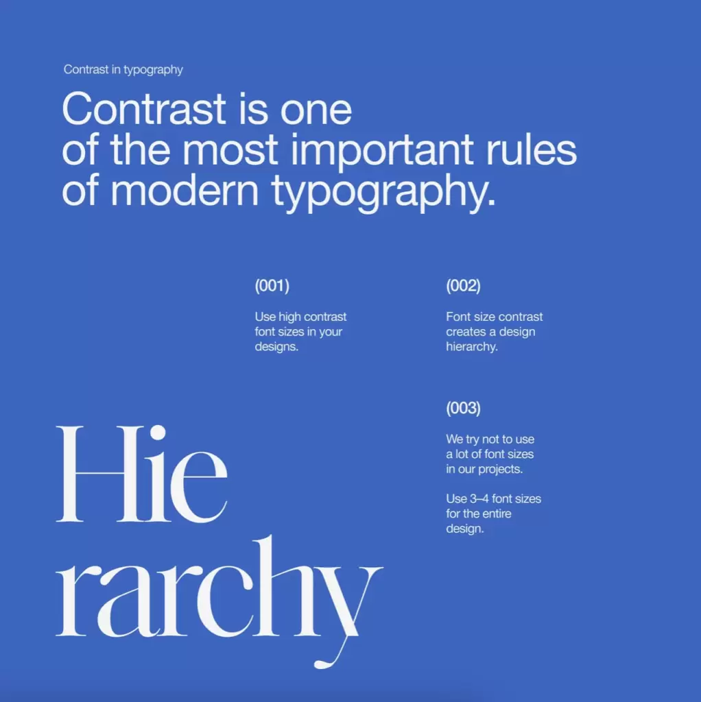
Contrast catches the eye, attracts attention, creates focal points, and helps establish visual hierarchy, especially when there is a lot of information.
1. Hierarchy, Accent
Size contrast in typography is essential to create hierarchy. For this principle to work well, there must be a lot of contrast between the font sizes. Below is an example of one of the good typography hierarchies on the web. It is important to avoid small differences in font size.
2. Color & Form Contrast
Use color contrast to highlight important elements, details, words, etc. There are classic examples of color contrast.
For example: black + white + bright color (red/yellow/blue/green). The rest of the elements will be built around it.

In projects try to choose 2–4 font sizes for the whole project not to make many styles. The step between them should be large – 90pt/60pt/30pt/14pt. These parameters will allow you to make the contrast.
Terms of Use & IP Notice: FRContent LLC (FRC) reserves the right to update these Terms and our Intellectual Property Matrix at any time to account for shifts in AI regulation, market intelligence standards, and IP law. The version published here serves as the exclusive and governing agreement for all active, pending, and past engagements. By continuing to access our systems, utilize our data, or deploy our Work Product (including but not limited to strategic copy, media frameworks, and AI-augmented creative), you expressly acknowledge and accept the current terms in their entirety. It is the Client’s sole responsibility to review this page periodically for updates. Use of any FRC asset while in a state of payment delinquency constitutes a waiver of use rights and a transition to willful IP infringement.
© 2026 FRC - All rights reserved